Embry-Riddle Aeronautical University
Admissions Application Redesign
Introduction
In my capstone design course, we were tasked with creating a usability methodology, testing an existing software, and redesigning that software. We worked in teams of four and were asked to redesign the school's admissions application to optimize it for mobile device use. This work spanned the course of a month and all work was equally dispersed amongst the team.
Problem Statement
Due to the fact that this was a school project we had our problem statement provided to us by the professor.
Improve the process of submitting an application for admission to the Master degree program for Human Factors at Embry-Riddle Aeronautical University, particularly when utilizing a mobile device.
Design Methodology
We started off by drafting up a research question based upon what we wanted to discover through the course of the redesign. "Is the admission application process intuitive & user friendly on a mobile device?" This question helped to center our research, testing, evaluation, and eventual redesign. From here we were able to create a set of goals for the project:
- Uncover usability deficiencies
- Find opportunities to improve designs
- Benchmark and validate with a variety of metrics
- Suggest areas of improvement with an interactive prototype
Information Architecture
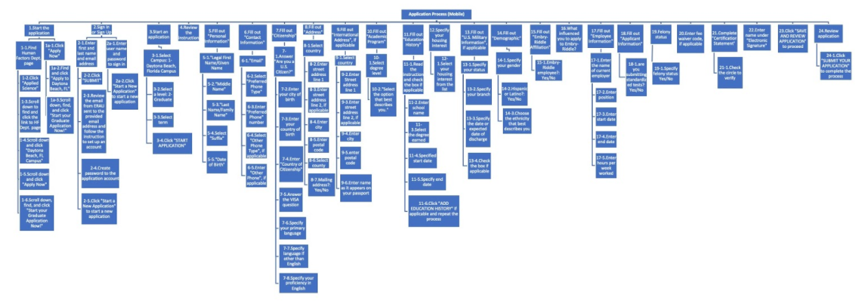
Usability Testing
In order to have well-rounded results that lacked obvious, school affiliated biases we used two methods for collecting usability results.
Moderated Usability Testing
- Students from within the student body who have already completed an admissions process - more likely to apply to the masters program than remote testers
- In person testing creates opportunity for follow-up and impromptu dialogue
- Less structure lends itself to more qualitative data
- Clear bias as they are more familiar with Embry-Riddle tools & software
Unmoderated Usability Testing
- Needed to create screener within testing software to ensure users had the potential to be in the given situation - looking for college degree or higher
- Remote testing takes away ability to ask questions or get additional information
- Very rigid, quantitative data
- Fresh eyes - users have never seen any of the tools and will be able to more fairly judge
Task List
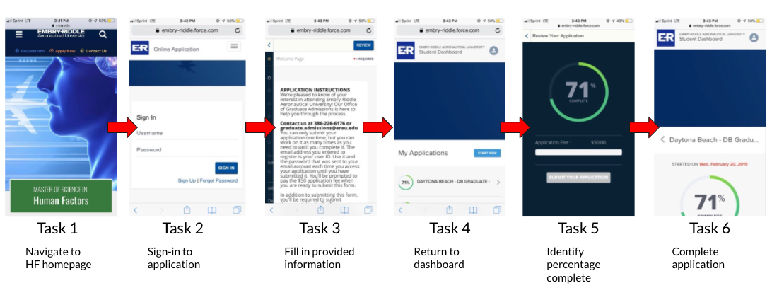
Once we had a plan together for how we wanted to test both our remote and in-person users, we began scouting participants. When we had them, we began testing over the course of a week.
Analyzing Results
After the testing concluded, we began evaluating the data that we had collected. We separated things between moderated and unmoderated initially and eventually combined to get a general sense of changes that needed to be made. We collected the following:
Quantitative
- Completion Time
- Success
- Difficulty 1 - 5
- Ease of use 1 - 5
- Likelikhood of recommendation 0 - 10
Qualitative
- Product Reaction Words
- Frustrations
- Improvements
- Repeated remarks
- Likes
Through our data and notes we were able to uncover pain points within the process. We documented these pain points and used them to inform our design decisions when we began to wireframe and iterate.
Pain Point: Application navigation is cumbersome on a mobile device
Design Recommendation: Application split into separate pages to make the process mobile friendly
Pain Point: Sign-up process is confusing to users
Design Recommendation: Sign-up process streamlined with clear instructions provided
Pain Point: Application requirements are split between two applications
Design Recommendation: Consolidation of application requirements into the initial application program
Wireframing
We put our recommendations into action by creating wires that improved upon the original workflow.
Classic UI
Proposed UI
Portfolio Projects
Patient EnrollmentProject type

Review ProcessEnterprise Application Redesign

Admissions ApplicationEducation
SearchEnteprise Application Redesign
