Review Process
Enterprise Application Redesign
Introduction
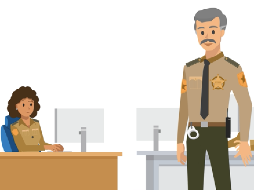
CentralSquare Technologies is a leader in providing public safety software, but their Records Management System (RMS) is outdated. With such tight competition in the industry, a design overhaul was overdue. In order to accomplish a complete renovation of their classic UI across the entire product, my team started by broadly defining sections. This definition brought us to our first, largest, and most used problem area, called Data Entry. We set out to reimagine Data Entry and along the way found that we could improve communication between officers and supervisors using an overlooked subsection which was later named Review Process.
This project is under NDA. If you would like more information, please email me.
Problem Statement
Reimagine a basic comment panel into a full-fledged communication tool by doing the following:
- Create a clear differentiation between the reporting process and the review process
- Introduce granularity to the process in order to pinpoint issues in reporting
- Establish a conversational aspect to comments
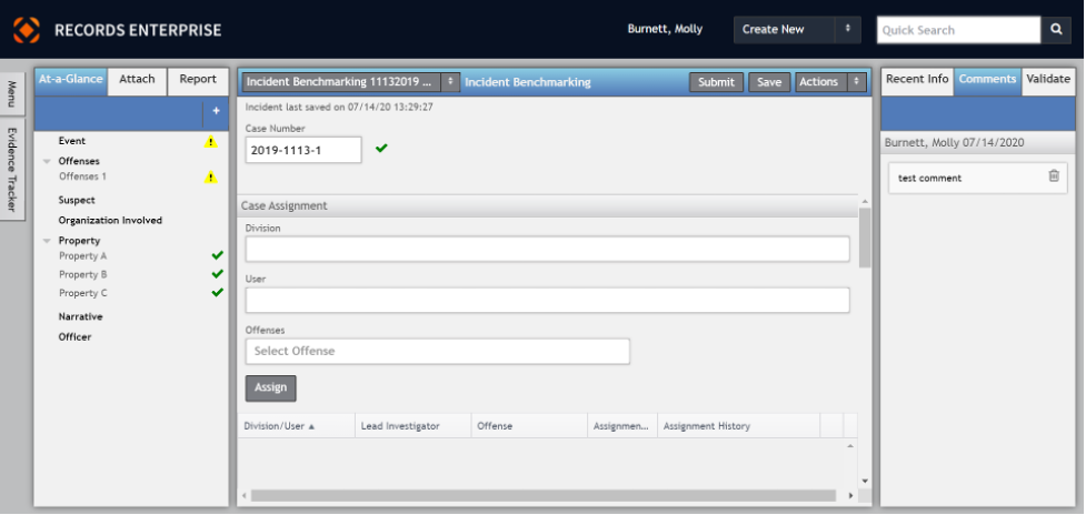
Current view of RMS
My Role
I worked as the lead UX designer on this feature. Since I was an associate designer at this time, fresh out of university, I was assisted by a senior UX designer and a senior UI designer.
- Interviewed and did discovery work with a variety of customers already using the product - learned how they were using it and uncovered pain points
- Talked to a variety of SMEs & internal stakeholders to help define the feature
- Created an initial set of wires incorporating a variety of ideas from the above
- Built an interactive prototype
- Planned, executed, and analyzed results from usability testing
- Presented usability findings to product and developers - worked together to iterate
- Worked with UI designer to hand off a polished, efficient, and well executed final design
- Followed up with professional services and early adopter clients to evaluate the effectiveness of the design
My Process
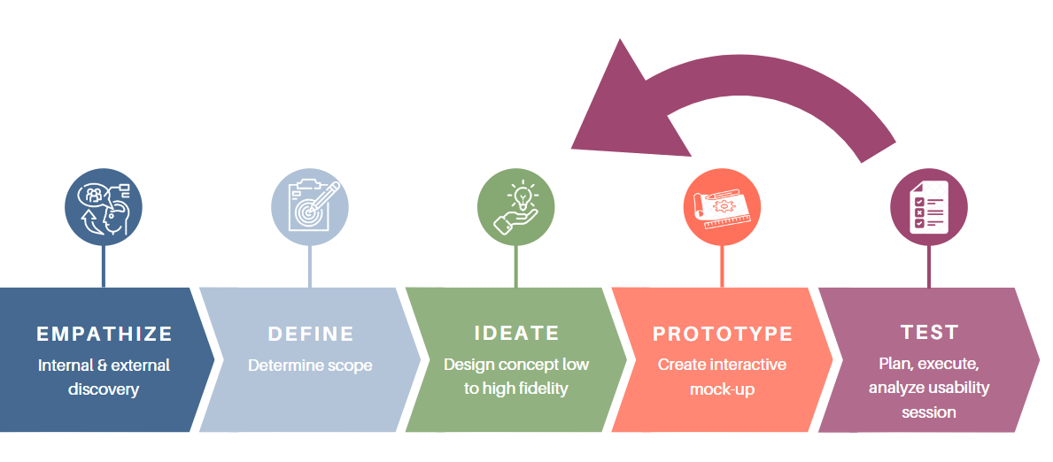
Empathize
Call this section "notes, notes, notes." I acted like a sponge during this phase of the design, soaking in as much information as I could. The purpose of this phase is to give me a base to work off of. I want to know how the feature is currently being used, if there's parts of the feature worth salvaging, what are the pain points the customers are facing, why are we interested in this as a solution, etc.
- Read internal documentation to familiarize myself with the comments in the classic UI
- Met with product owners to understand foundational information
- Scheduled meetings with a variety of customers
- Synthesized all the information from these meetings into workable ideas
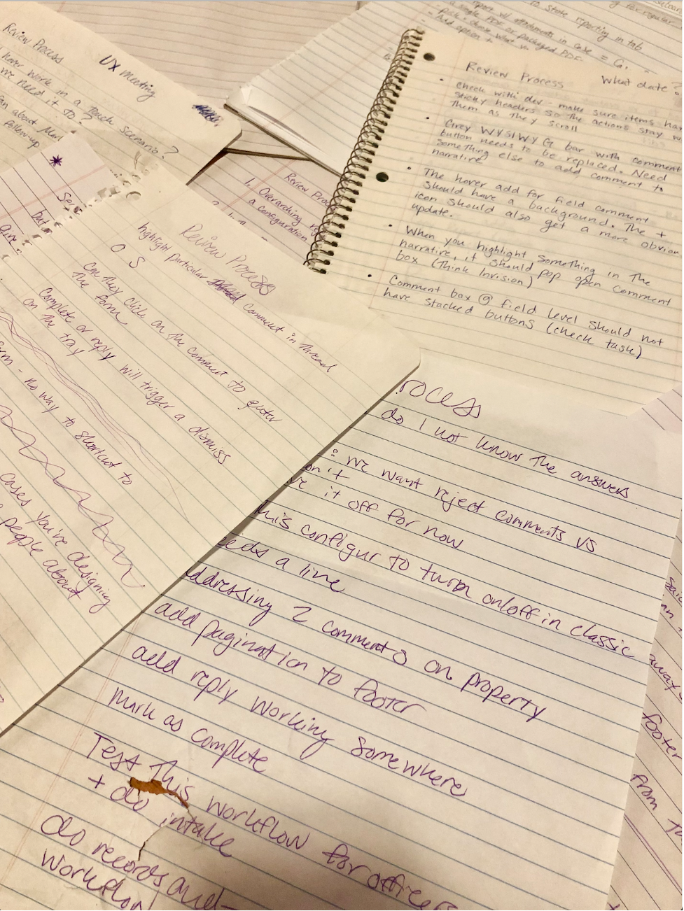
My notes
Define
What we're trying to do here is determine our scope. We talk across functional teams to discuss what we think should be prioritized. We work heavily with the product owner to figure out how to balance user needs and team resources.
Ideate
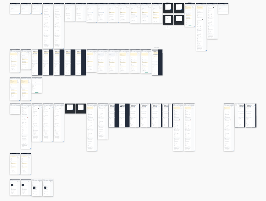
Multiple iterations of Review Process
Putting our ideas in action! This phase of the process is wildly iterative (as the name suggests). We're trying a bunch of things out, bouncing ideas around with one another, basically just getting everything out of our heads and onto a page. I'm always trying to keep in mind what I've learned in the past few phases. I want to do a great deal of exploring here so I often spend time browsing and looking for designs that could benefit ours. This feature is new to the product so we have a lot more wiggle room to dive into radical designs that don't have to match any classic UI.
- Whiteboarding sessions with UX/UI team
- Paper wires
- Low fidelity wires in Sketch
- High fidelity wires in Sketch
Prototype
Here we're getting prepared for usability testing. Working closely with my UI designer, we create a clickable, interactive mock-up. This needs to be polished enough that it isn't malfunctioning during testing, but low fidelity enough that users don't have grand expectation about about what they can do with it.
Review Process Prototype
Test
During this phase, we are attempting to evaluate the effectiveness of our designs. Having users perform routine tasks using the new UI helps us to identify any faults or areas that may need additional work. We keep the assessment very structured and move into a more opened-ended set of questions and ratings once tasks are complete. The results are evaluated and used as a basis to identify what, if anything, needs to be changed before development.
- Write a script
- Reach out to customers - schedule each user individually
- Perform the evaluation - take notes, recordings
- Synthesize results - record quantitative and qualitative metrics
- Analyze results and create presentation for development and product
Next Steps
After we finish a design, test it, and supply it to the proper channels, there's a few things we do before moving on.
- Consult with development to ensure that any questions are answered and make sure that designs are executed precisely
- Benchmark our classic UI against our new UI to validate areas of efficiency and effectiveness
- Interview our early adopters to ask follow-up questions about designs
- Revisist any out of scope ideas when time allows
Portfolio Projects
Patient EnrollmentProject type
Review ProcessEnterprise Application Redesign

Admissions ApplicationEducation
SearchEnteprise Application Redesign